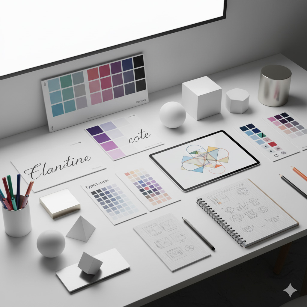
Understanding Design Elements: The Building Blocks of Great Visuals
Every masterpiece, from a business logo to a website layout, starts with one thing: the elements of design. These are the visual ingredients that, when combined correctly, make a design work.
At Sammyk Graphix, we believe that before you can break design rules, you need to understand them. The mastery of design elements turns simple ideas into powerful visual stories.
1️⃣ Line — The Foundation of Structure
Lines guide the eye, divide space, and create emotion.
- Horizontal lines = calm and stability
- Vertical lines = strength and growth
- Diagonal lines = motion and energy
- Curved lines = softness and fluidity
Lines are everywhere — in logos, borders, icons, and typography. Great designers use them to control flow and create rhythm in a layout.
NOTE: Use subtle grid lines in your layout design to maintain alignment and structure without making them visible.
2️⃣ Shape — Giving Form to Ideas
Shapes define boundaries and convey meaning instantly.
- Geometric shapes (circles, squares, triangles) → structure and order
- Organic shapes (leaves, blobs, curves) → creativity and natural flow
- Abstract shapes → concept-driven visuals
Example:
- A circle in a logo can represent unity or infinity.
- A triangle may express direction, balance, or energy.
At Sammyk Graphix, we blend geometric precision with organic creativity for balanced, memorable branding.
3️⃣ Color — The Emotion Behind Design
Color isn’t just about beauty — it’s about feeling.
The Psychology of Color
- Red: Passion, energy, excitement
- Blue: Trust, professionalism, calm
- Yellow: Joy, optimism, friendliness
- Green: Growth, health, balance
- Black: Luxury, authority, sophistication
- White: Purity, simplicity, clarity
Using Color Harmony
- Complementary colors (opposites on the color wheel) create contrast.
- Analogous colors (side-by-side on the wheel) create harmony.
- Monochromatic schemes create elegance through tonal consistency.
NOTE: Keep accessibility in mind — ensure enough contrast between text and background for readability.
4️⃣ Texture — Adding Depth and Realism
Texture brings dimension. It can make a flat image feel tangible.
There are two kinds:
- Tactile texture: The physical surface (paper grain, fabric weave).
- Visual texture: The illusion of touch (digital gradients, shadows, patterns).
In digital design, subtle textures (like soft gradients or grain overlays) prevent layouts from feeling sterile.
Example: Adding a soft grain texture to a web background gives it warmth and personality.
5️⃣ Space — The Art of What You Don’t Use
Also known as negative space, this is the area around and between design elements.
Space creates focus, balance, and elegance. It prevents clutter and gives the eye room to breathe.
- White space isn’t wasted space — it’s design breathing room.
- Strategic spacing emphasizes important content (like CTAs or logos).
Apple’s clean, minimalist layouts are perfect examples of effective use of space.
NOTE: Master spacing, and you master visual hierarchy.
6️⃣ Form — Making It Feel 3D
Form refers to three-dimensional shapes — giving depth and volume to visuals.
- Flat design focuses on simplicity (great for modern brands).
- Skeuomorphic design uses shadows and highlights to mimic realism.
- 3D elements add immersion and energy, especially in motion design.
At Sammyk Graphix, we use depth creatively in web design — balancing realism and modern minimalism for a rich visual experience.
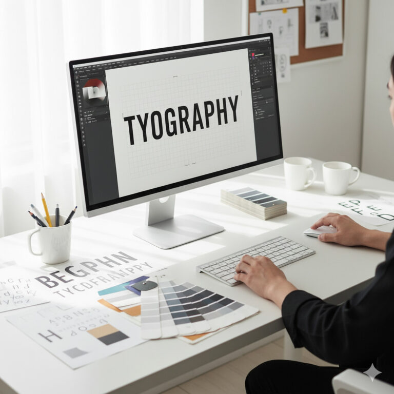
7️⃣ Typography — The Voice of Design
Typography turns text into art. It communicates tone, personality, and hierarchy.
The Basics
- Serif fonts: Classic, reliable, formal
- Sans-serif fonts: Modern, clean, approachable
- Script fonts: Elegant, creative, expressive
Hierarchy and Contrast
- Use font weight and size to guide attention.
- Pair complementary fonts for contrast (e.g., bold sans-serif header + light serif body).
- Maintain consistent spacing for readability.
NOTE: Don’t use more than 2–3 font families in one project. Simplicity amplifies clarity.
8️⃣ The Relationship Between Design Elements
No element exists alone. Design success lies in balance and interaction.
- Lines and shapes create structure.
- Color and texture evoke mood.
- Space and form define focus.
- Typography gives everything voice and context.
When these work together, your visuals become cohesive, professional, and memorable.
At Sammyk Graphix, we treat each design like a symphony — every element contributes to the final harmony.
9️⃣ Applying Design Elements in Real Projects
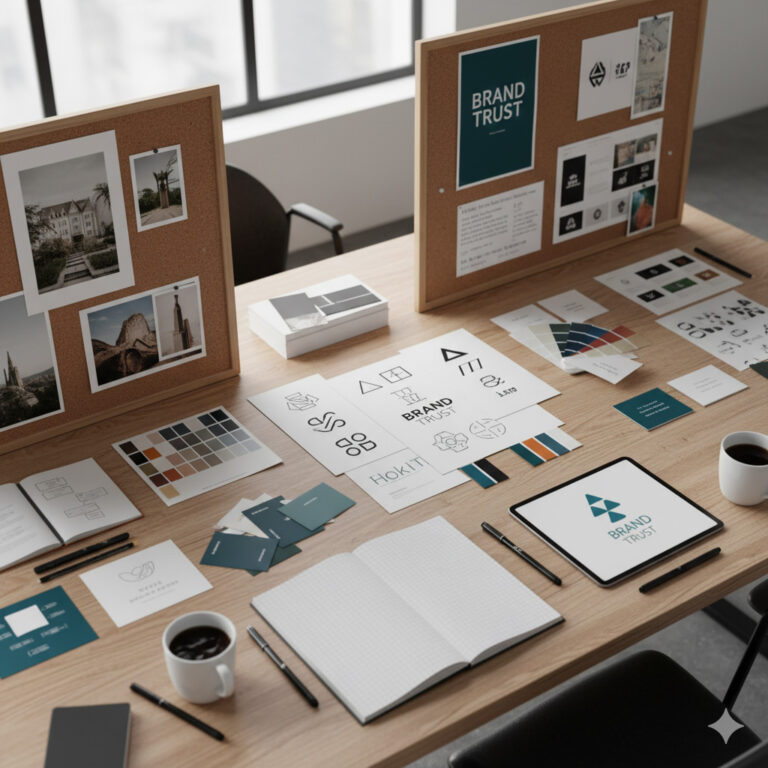
Logo Design: Use shapes for symbolism, color for emotion, and space for memorability.
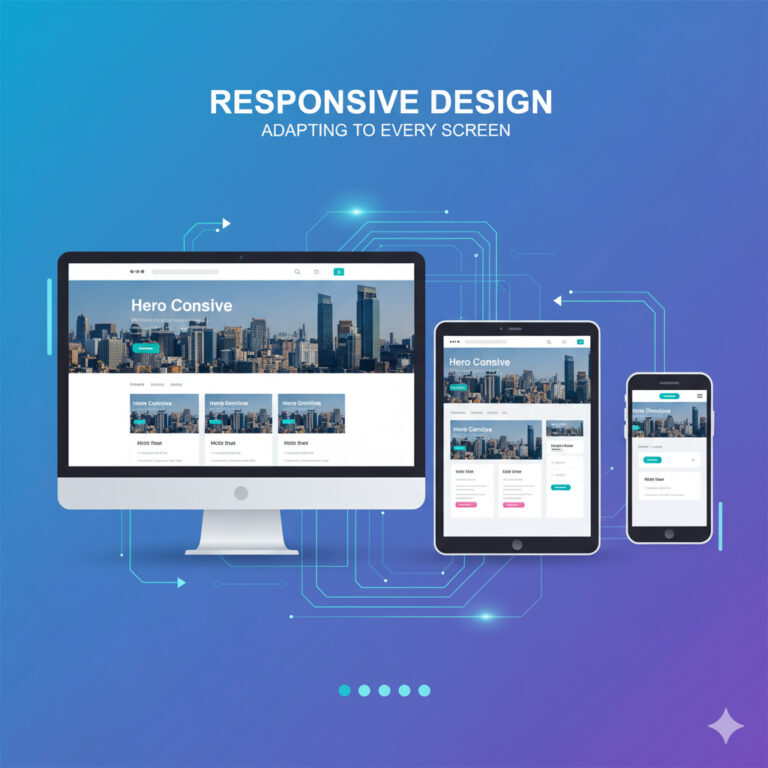
Web Design: Balance typography with negative space and consistent color schemes for usability.
Social Media Graphics: Use contrast and bold type to grab attention fast.
Print Materials: Incorporate texture and form to give tactile value to brochures or business cards.
Real-world application transforms theoretical design into impactful storytelling.
🔟 Common Mistakes Designers Make (and How to Avoid Them)
- Too Many Fonts: Creates visual chaos.
- Ignoring Hierarchy: Viewers don’t know where to look first.
- Poor Contrast: Text becomes unreadable.
- Overcrowded Layouts: No space = no focus.
- Color Misuse: Wrong palette changes brand perception.
Solution: Keep it simple. Use restraint. Consistency beats complexity.
Great design doesn’t happen by chance — it’s built deliberately using the elements of design. Every line, color, and space tells part of a story.
At Sammyk Graphix, we don’t just design — we communicate visually. We combine balance, color psychology, and structure to craft designs that speak to both heart and mind.
Ready to elevate your visuals?
Partner with Sammyk Graphix and let’s turn creative ideas into strategic masterpieces.