The Importance of Responsive Web Design in Today’s Mobile World
We live in a mobile-driven world. Over 70% of global web traffic now comes from smartphones and tablets, and Google prioritizes mobile-first indexing for search rankings.
This means if your website isn’t responsive — you’re already losing visitors, leads, and visibility. At Sammyk Graphix, we design websites that look stunning and function flawlessly across all devices — from desktops to smartphones. In this post, we’ll break down what responsive design is, why it matters, and how it can transform your business in 2025 and beyond.
1️⃣ What Is Responsive Web Design?
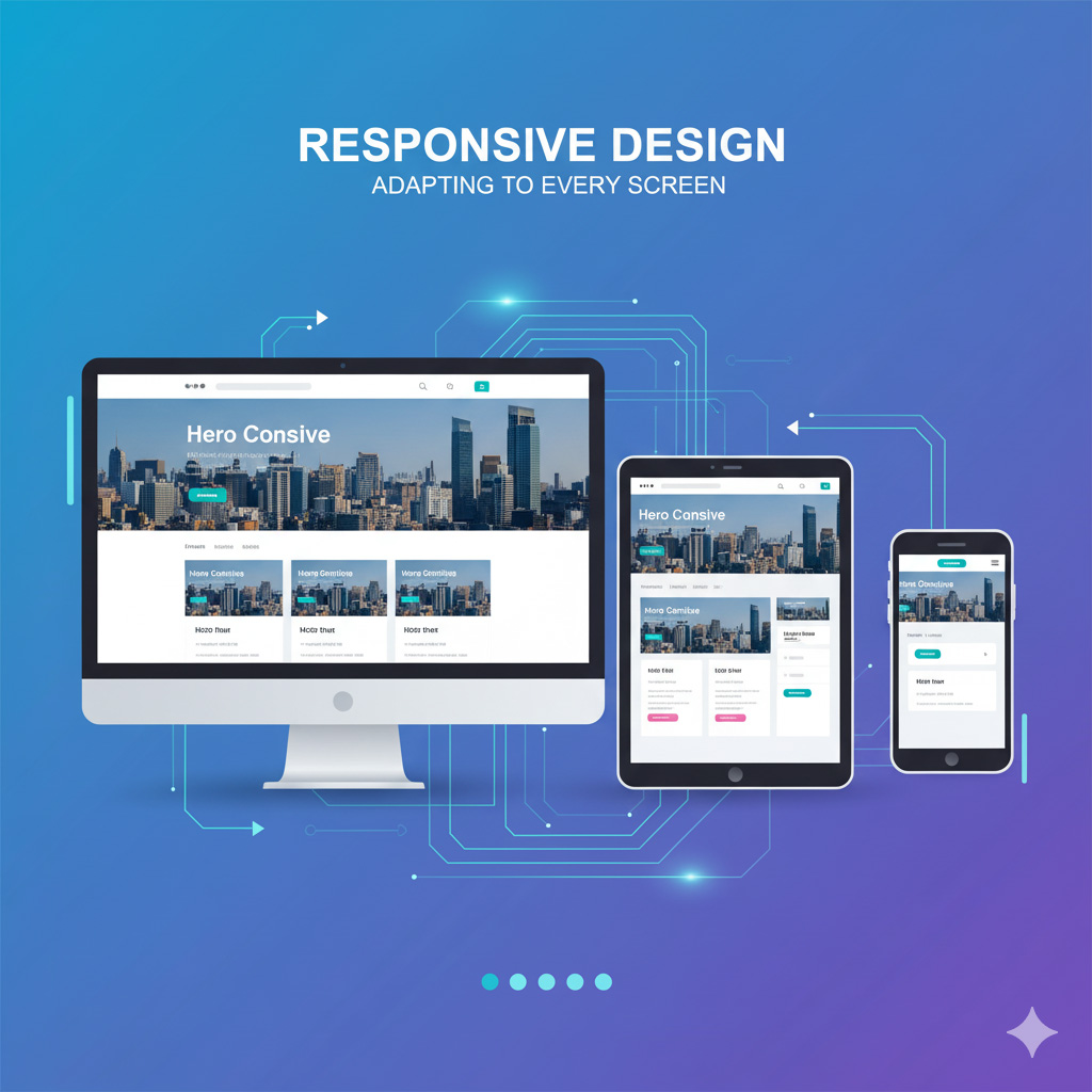
Responsive web design is the practice of building websites that automatically adjust their layout and content to fit any screen size or device.
In Simple Terms:
Your website “responds” to the user’s device — resizing, reorganizing, and optimizing content for the best viewing experience.
Example:
A responsive site ensures your images resize properly, your buttons remain clickable, and your text stays readable — whether someone is browsing on a phone, tablet, or desktop.
2️⃣ Why Responsive Design Is Non-Negotiable in 2025
In today’s digital landscape, responsive design is no longer an option — it’s a necessity.
Here’s Why:
- Mobile Traffic Dominates: More than half of your potential customers are browsing on mobile. If your site isn’t mobile-friendly, they’ll bounce off in seconds.
- Google Prioritizes Mobile-First Indexing: Google crawls and ranks your mobile version first — meaning if it’s poorly optimized, your SEO will suffer.
- Better User Experience: Visitors expect seamless browsing. A well-optimized responsive site boosts engagement, retention, and trust.
- Increased Conversions: A responsive design keeps your CTA buttons, forms, and purchase flows intact — leading to more sign-ups and sales.
- Faster Load Times: Mobile-optimized designs load quickly — reducing bounce rates and improving search rankings.
3️⃣ The Business Impact of Non-Responsive Websites
Still not convinced? Let’s look at the numbers:
| Metric | Responsive Site | Non-Responsive Site |
|---|---|---|
| Bounce Rate | ↓ 40% lower | ↑ 60% higher |
| Conversion Rate | ↑ 35% higher | ↓ 45% lower |
| Average Visit Time | 3–5 mins | Under 1 min |
| Google Ranking | Higher | Penalized in SEO |
Stat: 57% of users say they won’t recommend a business with a poorly designed mobile site.
At Sammyk Graphix, we’ve seen clients double their website engagement after switching to fully responsive layouts.
4️⃣ Core Principles of Responsive Design
Responsive design is built on three main principles that ensure smooth performance and visual balance across devices.
1. Fluid Grids: Designers use flexible grids that scale proportionally, not pixel by pixel.
2. Flexible Images: Images automatically resize based on screen width — no cropping or distortion.
3. Media Queries: CSS media queries detect device sizes and apply the right styles for each one.
Example:
On a desktop, you might see a three-column layout. On mobile, that same content stacks neatly into one scrollable column.
5️⃣ How Responsive Design Boosts SEO
Responsive design isn’t just about appearance — it’s a major SEO ranking factor.
Here’s How It Helps:
- Mobile-First Indexing: Google ranks mobile versions first.
- Faster Loading Speed: Responsive layouts reduce unnecessary scripts and heavy images.
- Lower Bounce Rate: Engaging, readable layouts keep users longer.
- Unified URL Structure: No need for separate “m.example.com” versions.
- Better Backlink Value: SEO authority flows to one site version.
Pro Tip:
At Sammyk Graphix, we optimize WordPress sites with Kadence Theme and Elementor to ensure pixel-perfect responsiveness and top-tier SEO performance.
6️⃣ User Experience (UX): The Heart of Responsive Design
Modern web design isn’t just about aesthetics — it’s about usability.
A responsive website provides:
- Easy navigation with clear menus
- Touch-friendly buttons
- Proper text sizing and spacing
- No zooming or horizontal scrolling
- Smooth animations that don’t lag
Example:
Imagine a user trying to fill out a contact form on a non-responsive website — they’ll struggle with small fields and misplaced buttons. That frustration often leads to abandonment.
Responsive design fixes that by adapting the interface for touch, comfort, and clarity.
7️⃣ Mobile-First Design — The Modern Approach
In 2025, the best designers no longer build desktop-first websites — they design mobile-first.
Why Mobile-First Works:
- Forces you to focus on core content and usability
- Improves loading speed
- Creates consistency across all devices
- Enhances accessibility for all users
Design Tip:
At Sammyk Graphix, we start every web project with mobile mockups first — ensuring smooth performance and visual impact across every device size.
8️⃣ Tools and Frameworks for Responsive Web Design
If you’re building a responsive site, these tools are game changers:
Frameworks:
- Bootstrap — For grid-based responsive layouts
- Tailwind CSS — Utility-first design system
- Kadence Theme (WordPress) — Lightweight, flexible, and mobile-ready
- Elementor Page Builder — Drag-and-drop responsive controls
Testing Tools:
- Google Mobile-Friendly Test
- BrowserStack
- Responsinator
Pro Tip: Always test your site on real devices before launch — emulators can miss subtle responsiveness issues.
9️⃣ Common Mistakes in Responsive Design
Even the best designs can fail if not implemented correctly. Avoid these pitfalls:
- Ignoring touch targets (buttons too small)
- Overloaded pages with heavy scripts
- Fixed-width layouts that break on small screens
- Hidden navigation menus without icons
- Neglecting typography — small fonts kill readability
At Sammyk Graphix, our responsive designs go through multiple device tests — ensuring performance, usability, and beauty on every platform.
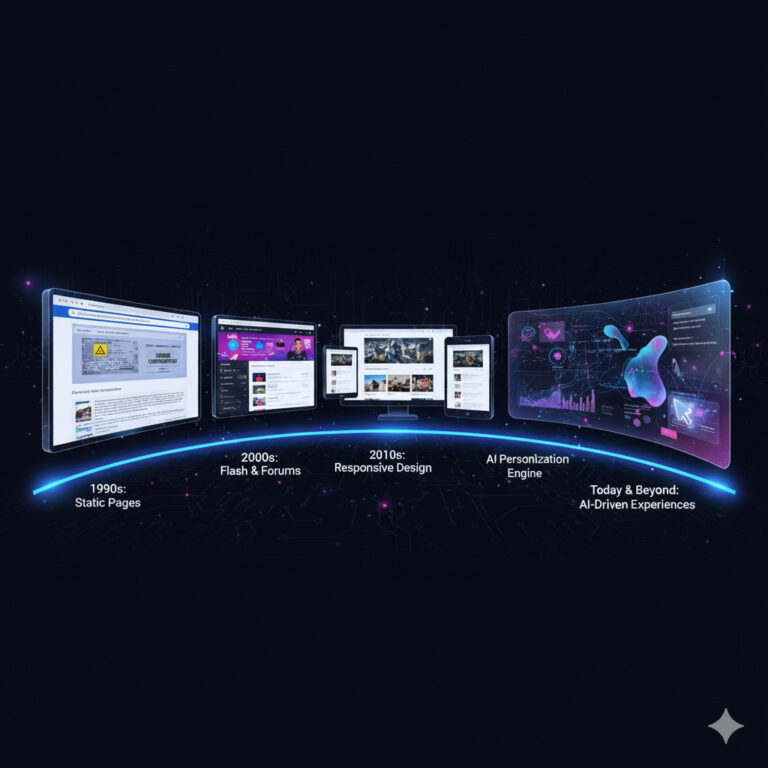
🔟 The Future of Responsive Design — AI and Beyond
The next frontier of web design goes beyond responsiveness — into adaptiveness and AI personalization.
What’s Coming:
- AI-driven layouts that adjust in real-time to user behavior
- Voice and gesture-based navigation
- 3D adaptive interfaces
- Automatic dark/light mode switching
- Progressive Web Apps (PWAs) that feel like native mobile apps
Pro Insight: The line between websites and mobile apps is fading — and responsive design is leading the transition.
In today’s mobile-first world, your website must adapt to every screen and every user. Responsive design ensures your brand looks professional, loads fast, and engages visitors no matter where they are.
At SammyK Graphix, we build websites that are:
✅ Fully responsive
✅ SEO-friendly
✅ Lightning fast
✅ Visually stunning
Ready to upgrade your website for the mobile generation?
Get in touch with SammyK Graphix — and let’s build a digital experience that performs beautifully on every device.