Design Principles: How to Create Balance, Contrast, and Visual Harmony
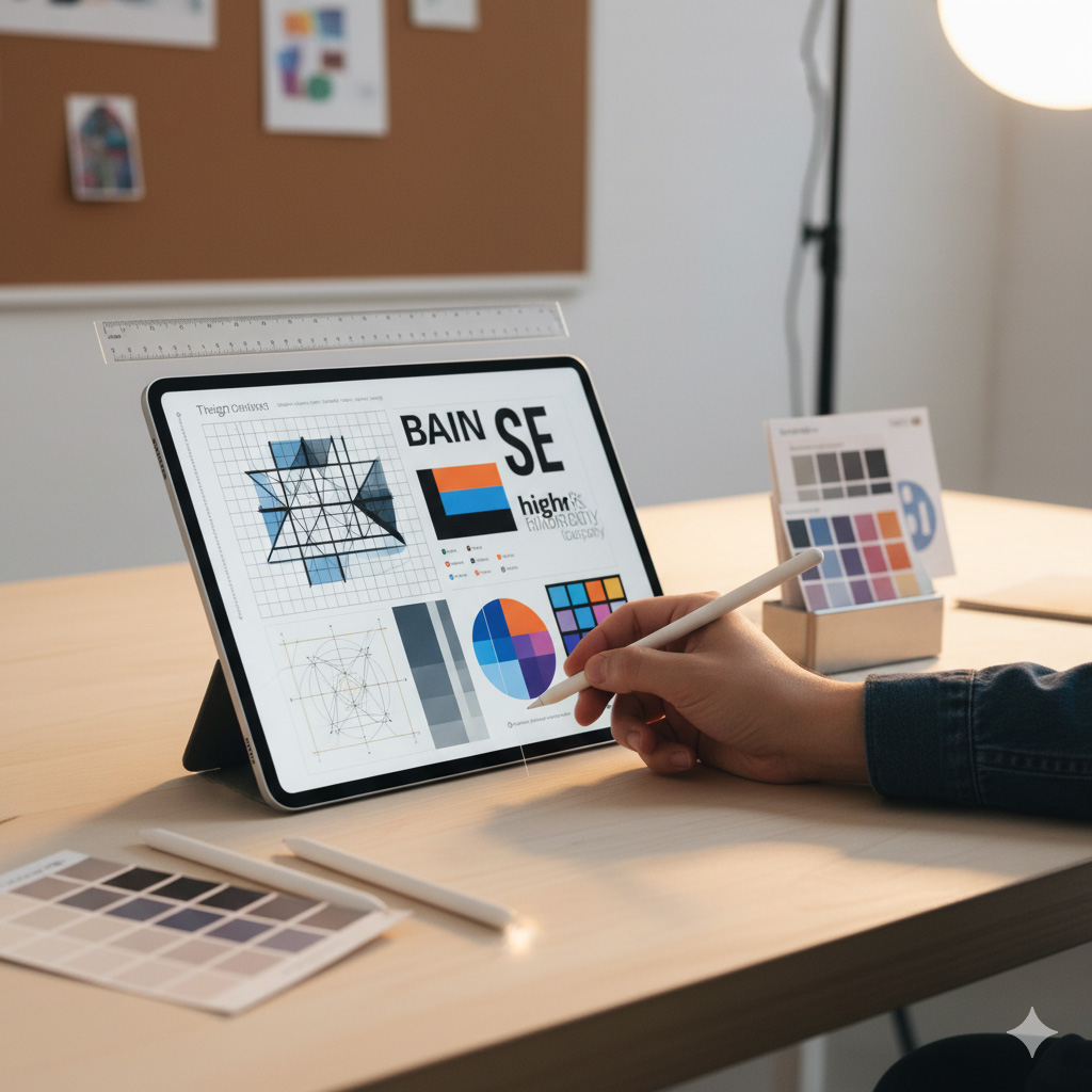
If the elements of design are the ingredients, the principles of design are the recipe. They tell you how to mix line, color, shape, and space into something that feels right to the eye and heart.
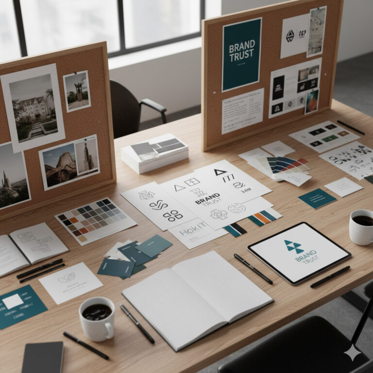
At Sammyk Graphix, every project—whether a logo, website, or ad campaign—follows these invisible rules to ensure beauty, clarity, and impact.
1️⃣ Balance — Achieving Visual Stability
Balance is how visual weight is distributed across a design. Without it, your layout feels off-kilter or confusing.
Types of Balance
- Symmetrical: Mirror-image arrangement; evokes formality and reliability.
- Asymmetrical: Uneven but visually equal; feels modern and dynamic.
- Radial: Elements radiate from a central point; conveys energy and focus.
Tip: Test balance by squinting—if one side feels “heavier,” adjust scale, color, or spacing.
2️⃣ Contrast — Creating Emphasis and Energy
Contrast draws attention and organizes information. It’s the secret to making headlines pop and buttons click.
Use contrast through:
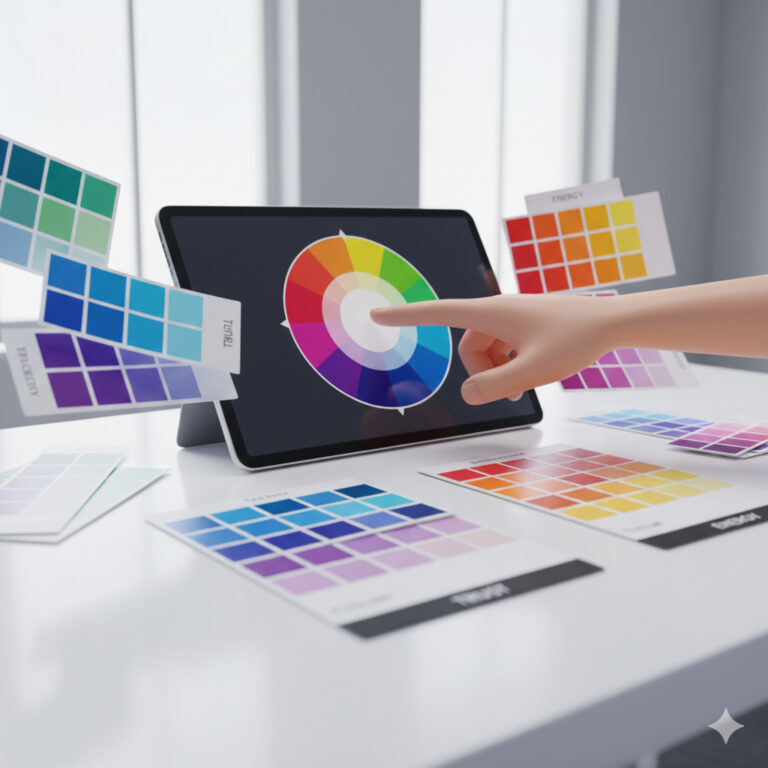
- Color: Light vs dark, warm vs cool.
- Size: Big headline, smaller sub-text.
- Shape: Rounded vs angular forms.
- Texture: Smooth background with rough overlay.
- Typeface: Bold sans-serif paired with elegant serif.
Tip: Limit your contrasts to two or three categories to keep cohesion.
3️⃣ Emphasis — Guiding the Viewer’s Eye
Every design should have a focal point—the element you want people to notice first.
Techniques to create emphasis:
- Bright color on a neutral background
- Larger scale or unique texture
- Strategic white space around key content
Example: On a landing page, emphasize the call-to-action button using strong color contrast and space around it.
4️⃣ Alignment — Creating Order Out of Chaos
Alignment ensures that every element visually connects with something else. It builds structure and professionalism.
- Left alignment: Best for body text and long paragraphs.
- Center alignment: Works for titles or formal layouts.
- Grid systems: Keep alignment consistent across designs.
Tip: Inconsistent alignment is the quickest way to make a design look amateur. Always align text, buttons, and visuals with intent.
5️⃣ Proximity — Building Relationships Between Elements
Grouping related items together helps the viewer understand hierarchy.
Examples:
- Headline, subhead, and paragraph should be close.
- Footer items like contact info and social icons belong together.
- Don’t scatter related visuals across the page—cluster them.
At Sammyk Graphix, we use proximity to make websites intuitive and easy to navigate.
6️⃣ Hierarchy — Directing Attention Step by Step
Hierarchy guides viewers through information in order of importance.
Establish hierarchy using:
- Size: Larger = more important.
- Color: Brighter = higher priority.
- Placement: Top or center draws eyes first.
Example: A poster headline grabs attention, supporting text explains, and logo finishes the story.
7️⃣ Rhythm — Giving Design a Visual Beat
Just like music, design needs rhythm to feel alive. Repetition and pattern create movement and flow.
Types of Rhythm
- Regular: Even spacing (grid layouts).
- Flowing: Curves and waves (organic designs).
- Progressive: Gradual change in size or color (dynamic infographics).
Tip: Use consistent spacing between sections on a website to establish rhythm that guides users smoothly downward.
8️⃣ Unity and Harmony — Making It All Belong
Unity ensures all elements feel like they belong together. Harmony creates a sense of calm coherence.
How to achieve it:
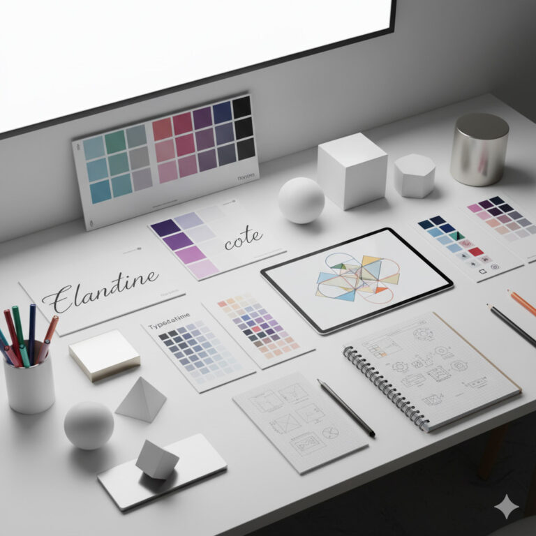
- Use a consistent color palette.
- Stick to one or two fonts.
- Maintain consistent icon styles and border radii.
- Apply the same tone across photography and illustration.
When everything feels connected, users feel comfortable—and that builds trust.
9️⃣ Real-World Examples
Logo Design: Balance and contrast help logos stand out while staying scalable.
Web Design: Hierarchy, proximity, and rhythm improve navigation and user experience.
Social Media Graphics: Emphasis and contrast grab attention in fast-scrolling feeds.
Print Materials: Alignment and harmony maintain readability in brochures or flyers.
At Sammyk Graphix, these principles turn visuals into clear, emotional communication tools.
🔟 Common Design Pitfalls to Avoid
- No Focal Point: Viewers don’t know what’s important.
- Poor Spacing: Makes designs feel cramped.
- Too Much Contrast: Overwhelms the viewer.
- Lack of Consistency: Fonts and colors vary randomly.
- Ignoring Alignment: Causes visual confusion.
Fix: Step back from your design—does it “feel right”? If not, re-check your principles.
Design is both freedom and discipline. The principles of design give creatives a framework to express ideas clearly while maintaining beauty and structure.
At Sammyk Graphix, we build every project—digital or print—on these timeless foundations. Because when balance meets contrast, and harmony meets purpose, magic happens.
Ready to bring structure and beauty to your brand?
Collaborate with SammyK Graphix and let’s design with purpose, not guesswork.