The Role of Color Psychology in Graphic and Web Design
Have you ever wondered why Facebook uses blue? Or why Coca-Cola feels energetic in red?
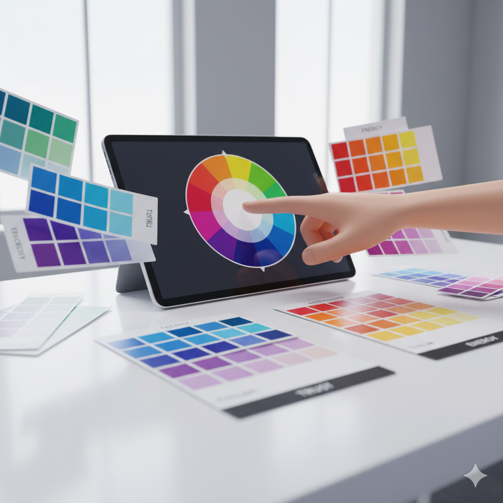
That’s color psychology — the science of how colors influence human emotion, behavior, and perception.
At Sammyk Graphix, we believe color isn’t decoration — it’s communication. Every shade tells a story, triggers a feeling, and defines your brand’s personality.
1️⃣ What Is Color Psychology?
Color psychology studies how hues affect human thoughts and emotions.
It’s not just theory — over 90% of people’s first impressions of a product are based on color.
Colors:
- Evoke emotions (warm vs. cool)
- Convey brand values (trust, energy, calm, creativity)
- Influence buying decisions
- Strengthen brand recognition
Tip: Brands that use consistent colors can improve recognition by up to 80%.
2️⃣ The Meaning Behind Colors
Each color carries psychological and cultural meaning. Understanding these helps you design with purpose.
| Color | Emotions & Associations | Common Use Cases |
|---|---|---|
| 🔵 Blue | Trust, calm, intelligence, loyalty | Tech, finance, healthcare (e.g., Facebook, PayPal) |
| 🔴 Red | Energy, passion, urgency, power | Food, sports, retail (e.g., Coca-Cola, YouTube) |
| 🟢 Green | Growth, health, balance, nature | Eco-friendly brands, wellness, agriculture |
| 🟠 Orange | Creativity, enthusiasm, confidence | Entertainment, marketing, youth brands |
| 🟣 Purple | Luxury, spirituality, imagination | Beauty, education, premium brands |
| 🟡 Yellow | Optimism, happiness, attention | Children’s products, lifestyle, travel |
| ⚫ Black | Power, elegance, sophistication | Fashion, luxury, photography |
| ⚪ White | Simplicity, purity, clarity | Minimalist brands, tech, design studios |
| 🩶 Gray | Neutrality, balance, professionalism | Corporate, tech, modern brands |
Each choice should align with your brand’s emotion and mission.
3️⃣ Warm vs. Cool Colors — Emotional Temperature
Warm Colors — (Red, Orange, Yellow)
- Stimulate energy and excitement
- Create urgency or call-to-action appeal
- Perfect for dynamic, passionate brands
Cool Colors — (Blue, Green, Purple)
- Evoke calmness, trust, and relaxation
- Ideal for healthcare, wellness, and professional services
Tip: Combining both can create emotional balance — warm tones attract, cool tones reassure.
4️⃣ The Psychology of Color in Branding
Color defines how people perceive your brand in seconds.
Here’s what different tones communicate in branding:
- Blue = “You can trust us.” (Calm and reliable)
- Red = “We’re exciting and bold.” (Energetic and confident)
- Green = “We care about balance and sustainability.”
- Black = “We’re luxurious and exclusive.”
- Orange/Yellow = “We’re creative and fun.”
At Sammyk Graphix, we help brands discover their emotional color language — ensuring your visuals speak to your audience’s hearts.
5️⃣ Cultural Influence on Color Meaning
Color meanings vary across cultures:
| Color | Western Meaning | Eastern Meaning |
|---|---|---|
| Red | Passion, excitement | Luck, prosperity |
| White | Purity, simplicity | Mourning, loss |
| Yellow | Happiness | Royalty, honor |
| Black | Power, elegance | Bad luck, death |
| Green | Growth, eco-friendliness | Youth, fertility |
Tip: If your business serves global audiences, research cultural associations before finalizing brand colors.
6️⃣ Color in Web Design — Creating Digital Emotions
Website design is where color psychology truly shines.
Here’s how colors influence website behavior:
- Blue CTA buttons = Trust and conversion confidence
- Red accents = Attention-grabbing for sales or urgency
- White backgrounds = Clean, breathable design
- Neutral tones = Focus on content, not distraction
- Green highlights = Approval and “Go” signals
Tip: Keep strong contrast between background and text to improve readability and accessibility.
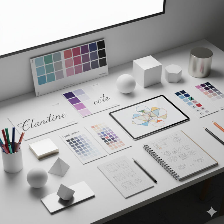
7️⃣ Color Harmony — Designing Balanced Palettes
A harmonious color palette brings structure and emotion together.
Common Palette Types:
- Monochromatic: Variations of one hue — clean and elegant.
- Analogous: Adjacent colors on the wheel — smooth and cohesive.
- Complementary: Opposite colors — bold and dynamic contrast.
- Triadic: Three evenly spaced colors — creative and energetic.
At Sammyk Graphix, we use these combinations strategically for brand impact and visual balance.
8️⃣ The Science Behind Color and Conversion
Color choices directly influence conversions and sales.
Examples:
- Red buttons boost urgency (perfect for “Buy Now”).
- Green buttons increase trust (“Get Started”).
- Orange CTAs attract clicks in creative industries.
Even slight hue shifts can improve engagement metrics by double digits. We test and tweak color combinations to maximize both emotion and conversion rates.
9️⃣ Accessibility and Color Contrast
Inclusive design means ensuring everyone can perceive your colors correctly.
Guidelines to follow:
- Maintain a contrast ratio of at least 4.5:1 for text.
- Avoid relying solely on color to convey meaning.
- Use patterns or icons alongside colors for emphasis.
Tip: Tools like Contrast Checker help ensure accessibility compliance (WCAG).
🔟 Tools for Choosing the Right Colors
Here are some free and professional tools you can use:
- Adobe Color Wheel – for palettes and harmony checks
- Coolors.co – quick auto-generated palettes
- Paletton – interactive color theory visualizer
- Canva Color Meanings – explores emotional tone of colors
- Khroma – AI-based color generator using your preferences
At Sammyk Graphix, we combine these tools with experience and psychology to build meaningful color systems.
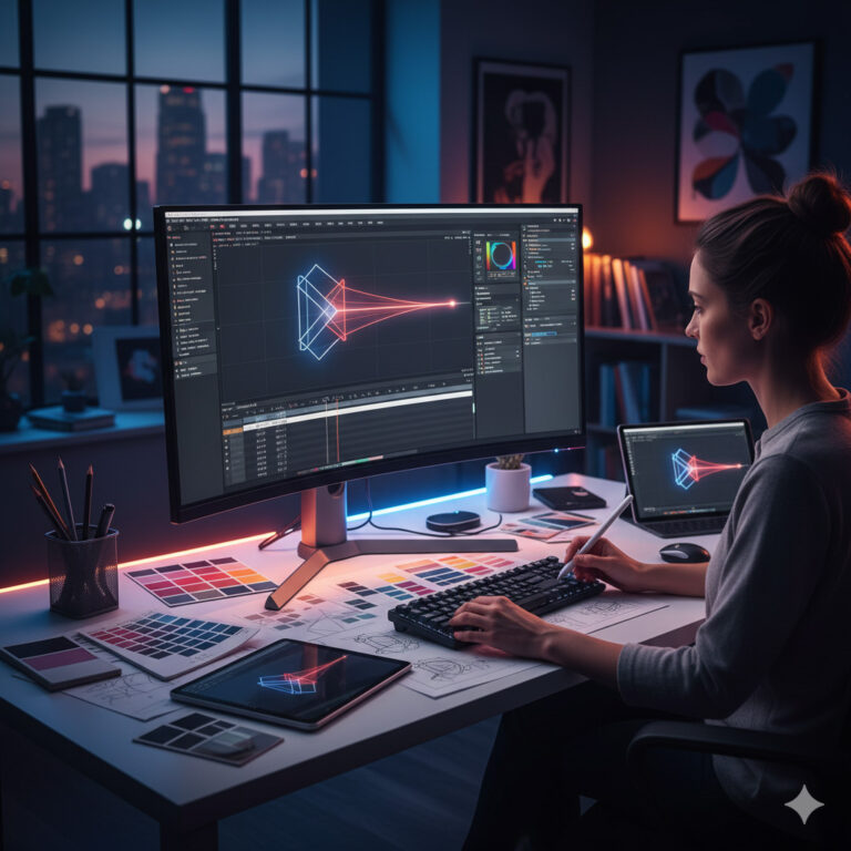
How to Create a Brand Color Strategy
Here’s our step-by-step approach at SammyK Graphix:
- Define Your Brand Personality – Serious, playful, innovative, or calm?
- Identify Audience Emotions – How do you want them to feel?
- Research Competitors – Stand out, don’t blend in.
- Build a Palette – 1–2 primary, 2–3 secondary colors.
- Test Across Media – Screens, print, packaging, and social.
- Create a Color Style Guide – Document usage rules for brand consistency.
Color is not random — it’s a strategy built on psychology and design science.
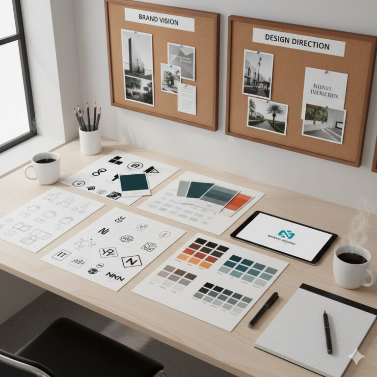
Case Study: How Color Redefined a Brand
Scenario:
A health startup approached SammyK Graphix using dark, aggressive reds and blacks. Their goal? To promote calm, trust, and wellness.
Solution:
We redesigned their palette using soft greens, muted blues, and natural beige tones.
Result:
- 47% increase in user engagement
- 32% higher newsletter sign-ups
- Stronger emotional connection with their audience
That’s the power of intentional color psychology.
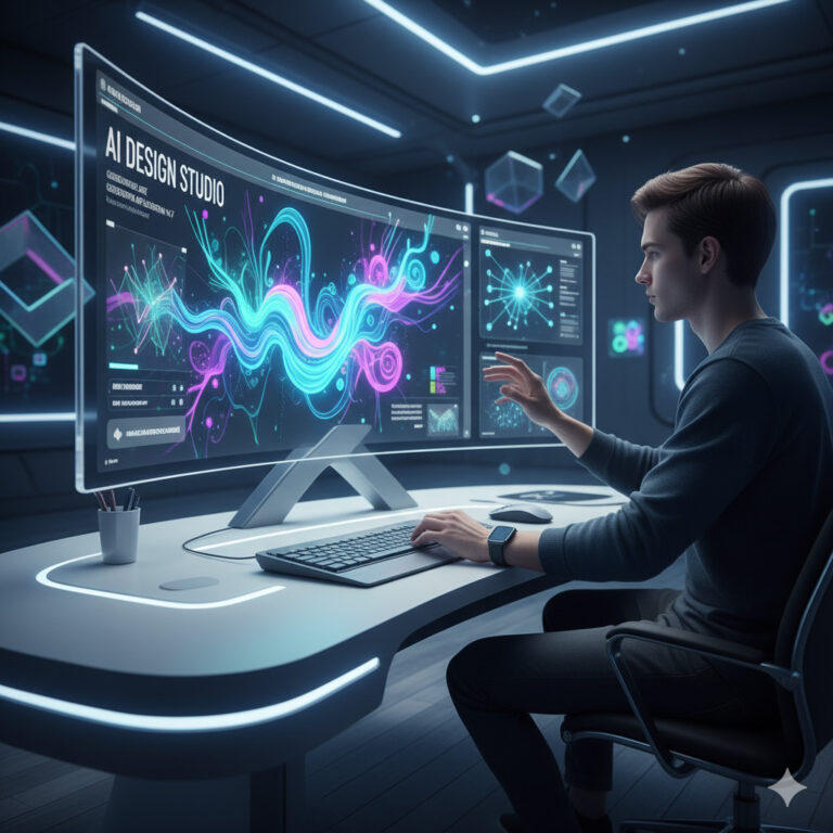
The Future of Color in Design
With AI and adaptive design systems, color usage is evolving rapidly.
Trends for 2025 and beyond:
- Dynamic color systems that shift based on user preference or mode (light/dark).
- AI-generated palettes that learn audience emotional response.
- Sustainability tones — natural, earthy hues dominating eco-conscious brands.
- Retro-modern revival — bold vintage tones reimagined digitally.
At Sammyk Graphix, we combine timeless color principles with modern tools to create forward-thinking designs.
Color is emotion, strategy, and identity combined.
The right palette makes people feel your brand before they read a word.
At Sammyk Graphix, we don’t just choose colors — we create color systems that tell your story and inspire trust, creativity, and connection.
Let’s bring your brand to life — one color at a time.
Get in touch with Sammyk Graphix to design your perfect color identity today.