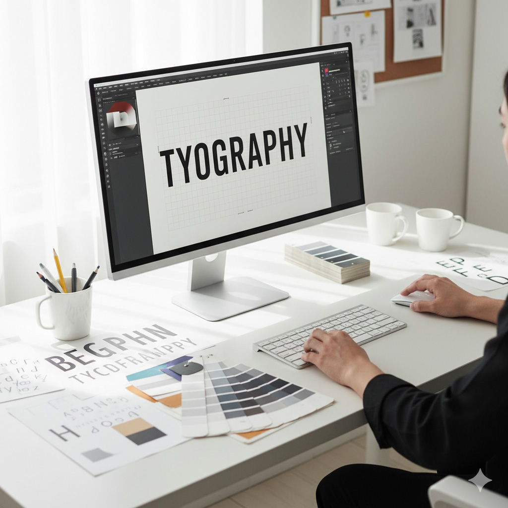
Typography Matters: Choosing Fonts That Speak for Your Brand
Typography is design’s silent ambassador. Even before you read a word, the look of the text communicates emotion, trust, and tone.
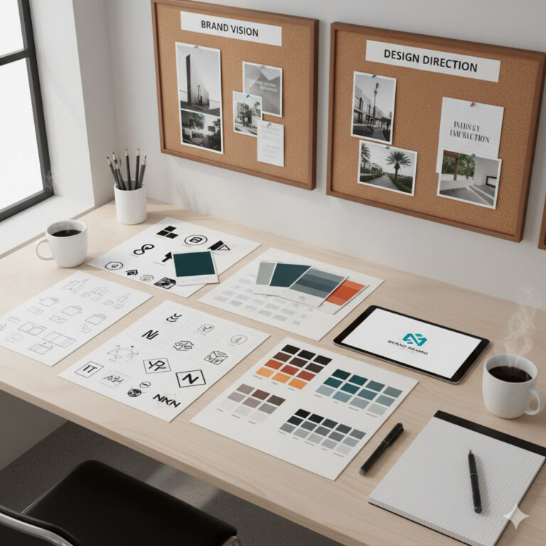
At Sammyk Graphix, we treat typography as more than letters — it’s voice, rhythm, and personality combined. A well-chosen font tells your story before the reader even begins.
1️⃣ What Is Typography?
Typography is the art and technique of arranging type to make written language legible, readable, and visually appealing.
It includes:
- Font selection
- Line spacing (leading)
- Letter spacing (tracking)
- Alignment
- Hierarchy
Typography transforms text into visual storytelling.
2️⃣ Why Typography Matters in Branding
A brand’s typography says as much about it as its logo or color palette. The right typeface builds trust and recognition.
Think of:
- Coca-Cola – flowing script = emotion and nostalgia.
- Apple – clean sans-serif = innovation and clarity.
- The New York Times – serif = authority and tradition.
Your type choice shapes perception instantly.
Tip: Consistency in typography strengthens brand recall by up to 80%.
3️⃣ The Psychology of Fonts
Each font style evokes a distinct emotional response:
| Font Type | Visual Tone | Best For |
|---|---|---|
| Serif | Traditional, trustworthy, elegant | Newspapers, law firms, luxury brands |
| Sans-serif | Modern, clean, approachable | Tech companies, startups, minimal brands |
| Script | Creative, personal, emotional | Weddings, beauty, lifestyle brands |
| Display | Bold, decorative, unique | Posters, headlines, ads |
| Monospace | Technical, neutral, efficient | Code, data, tech design |
Typography psychology helps match visual tone with brand intent.
4️⃣ Building a Font Hierarchy
Hierarchy guides readers through your content effortlessly.
- Headlines: Large, bold, high-impact fonts.
- Subheadings: Medium weight, complementary style.
- Body Text: Readable font, comfortable line height.
- Captions/Notes: Small but legible secondary type.
Tip: Keep your type hierarchy consistent across all platforms — web, print, and social media.
5️⃣ Font Pairing — The Art of Harmony
Mixing fonts is like pairing ingredients in a recipe. The goal: contrast without chaos.
Great Font Pair Examples
- Montserrat + Merriweather → Modern + Classic balance.
- Playfair Display + Lato → Elegant headlines, clean body text.
- Poppins + Open Sans → Friendly and professional.
Rules for pairing:
- Limit to two or three font families.
- Ensure contrast between weights or styles.
- Match emotional tone — not just aesthetics.
Tip: Google Fonts is a free, versatile source for great web-safe font pairings.
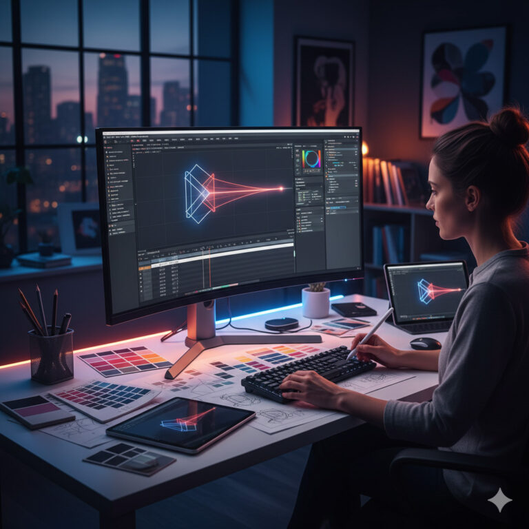
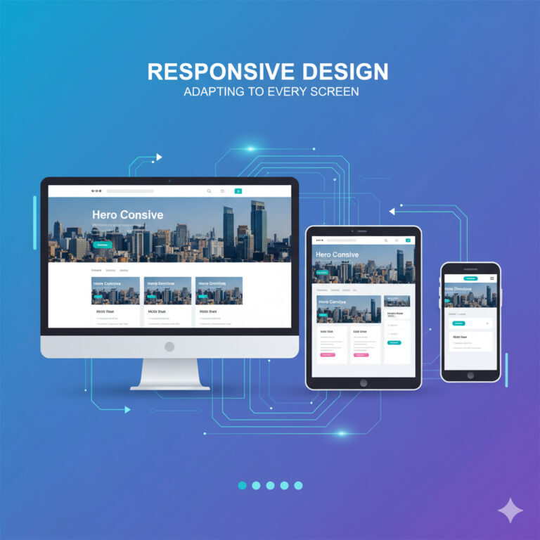
6️⃣ Typography in Digital Design
Typography must adapt across screens and devices.
- Use web-safe fonts for consistency.
- Maintain line length (50–75 characters per line).
- Ensure contrast for readability (especially in mobile).
- Use responsive type scaling in CSS (e.g.,
clamp()for font sizes).
At Sammyk Graphix, we test every design for accessibility and readability to ensure that type looks perfect everywhere — from desktops to phones.
7️⃣ Typography in Print Design
Print typography demands precision.
- Use high-resolution fonts (vector-based).
- Mind bleed areas — avoid text near edges.
- Adjust kerning for perfect letter spacing in large headlines.
- Use spot colors for consistent ink reproduction.
Tip: Serif fonts often print better due to their detailed edges, enhancing readability in long text.
8️⃣ Font Licensing — The Legal Side
Many designers overlook this! Using unlicensed fonts can result in copyright issues.
- Free fonts (e.g., Google Fonts) → safe for commercial use.
- Paid fonts → require license per use or per client.
- Custom fonts → exclusive branding advantage but higher cost.
Always read the End User License Agreement (EULA) before commercial use.
9️⃣ Common Typography Mistakes (and Fixes)
- Too Many Fonts: Creates clutter — limit to two or three.
- Poor Contrast: Light gray on white = unreadable.
- Ignoring Hierarchy: Makes designs confusing.
- Tight Line Spacing: Reduces readability.
- Overusing Decorative Fonts: Looks unprofessional.
Fix: Keep it simple. Choose fonts that enhance, not distract.
🔟 Typography Trends for 2025
- Variable Fonts: One file, many styles — flexible and lightweight.
- Retro Fonts Revival: 70s-inspired typography making a comeback.
- Bold Minimalism: Clean sans-serif fonts with strong personality.
- Kinetic Typography: Animated text bringing energy to videos and websites.
- AI-Generated Fonts: Custom styles created from prompts or sketches.
At Sammyk Graphix, we embrace innovation while maintaining timeless readability.
Typography is the unsung hero of great design. It influences trust, emotion, and perception. The right type choice can make your message unforgettable — the wrong one can make it invisible.
At Sammyk Graphix, we believe typography is more than style — it’s strategy. We craft every letter with purpose to ensure your brand speaks clearly and beautifully.
Ready to find your brand’s visual voice?
Work with SammyK Graphix and let’s choose fonts that make your message resonate.